There’s a specific moment in the paint selection process usually somewhere between the twelfth swatch pulled off the wall and the third glass of wine when someone puts a sample of tricorn black next to everything else on the table and the conversation quietly shifts. Not because it’s surprising. Because it’s not. It looks exactly like black should look, and it doesn’t make any apologies about it.
I’ve seen this happen with clients who started the colour conversation saying they’d never paint anything black, and ended up with a front door, shutters, and a kitchen island all in SW 6258 within six months. The colour has that quality. It doesn’t require you to commit to a mood or a temperature or a decorating decade. It just sits there being black, completely and reliably, and that absence of complication is genuinely rare in the dark end of the paint spectrum.
Sherwin Williams’ Director of Color Marketing Jackie Jordan described it as “definitely our blackest black, a really rich, deep perfect black” which is not the kind of quote a paint brand puts in front of their colour marketing director unless it’s actually true.
What LRV 2.4 Actually Means in a Real Room
Light reflectance value is the number that tells you how much light a paint colour bounces back into a room on a scale from 0 to 100. Pure white sits near 100. Pure black sits at 0. In the usable residential paint world, LRV 3 is about as low as you can practically go and tricorn black lands at 2.4 to 2.45 depending on the batch and the testing methodology you reference. That number means the colour absorbs almost all the light that hits it, which is what produces the velvety, inky, rich black that makes it perform differently from every dark grey or charcoal that tries to compete.
Caviar SW 6990 comes in at LRV 2.94 technically close, but that fractional difference is visible side by side, and Caviar carries a warm brownish undertone that gives it a softer, cozier character. Peppercorn SW 7674 sits at around LRV 10% that’s not a dark black, that’s a medium charcoal that will look significantly lighter than tricorn black in almost any space. Iron Ore SW 7069 reads as a very dark grey with subtle green undertones that flash slightly purple in certain lighting conditions. None of these are wrong choices for the right application. But none of them are tricorn black, which is specifically the point.
The LRV of 2.4 means something specific and practical in terms of how the colour behaves room by room. In a north-facing room with limited natural light, tricorn black deepens beautifully it doesn’t look like a hole in the wall, it looks like drama with controlled intent. In a room with generous natural light, it reads as crisp, graphic, and unambiguously black. Under warm evening or artificial lighting it might edge slightly toward charcoal, but it won’t show a colour cast the way Black Magic SW 6991 does Black Magic carries a slight purple undertone that becomes noticeable in evening lighting conditions. Black of Night SW 6993 has a subtle cool green undertone that shifts its character similarly. Tricorn black just stays black, which is the entire value proposition.
The No-Undertone Claim and What It Actually Holds Up Against
Most black paint colours have undertones. They’re often subtle enough to miss on a swatch card and obvious enough to be maddening once they’re on your wall. Blue undertones, brown undertones, green undertones all of them alter how the paint interacts with surrounding colours, natural materials, and changing light conditions. The thing that distinguishes tricorn black from almost every competitor in the deep black category is that it genuinely holds its neutral undertone position across lighting conditions, colour adjacencies, and finish variations.
The neutrality is relative and worth being precise about. If you place tricorn black next to a warmer black like Black Fox Sherwin Williams, it will lean slightly cool by comparison. Place it next to a cooler black and it reads relatively warmer. This isn’t instability it’s the nature of any neutral sitting between warm and cool without committing to either. What it means in practice is that tricorn black pairs with warm neutrals without fighting them and pairs with cool neutrals without competing. Brass hardware reads warm and luxurious against it. Chrome and brushed metal read clean and modern. Matte gold hardware next to a tricorn black front door is the specific combination that shows up in every design portfolio for good reason the contrast is high, the warmth is right, and it works whether the house is a Victorian terrace or a contemporary suburban build.
Benjamin Moore Black sits in comparable territory for those working outside the Sherwin Williams ecosystem. Benjamin Moore Black Tar is slightly lighter and not quite as true a black. Wrought Iron Benjamin Moore is a charcoal-grey that reads softer than a true black. Kendall Charcoal Benjamin Moore is another charcoal rather than a pure black. For pure, no-apologies black with neutral undertones, the Benjamin Moore equivalent that comes closest is Benjamin Moore Onyx but the colour match isn’t perfect, and attempting a direct colour match between brands carries the risk of a formulation that doesn’t perform identically.
Where Tricorn Black Works and Where It Earns Its Keep
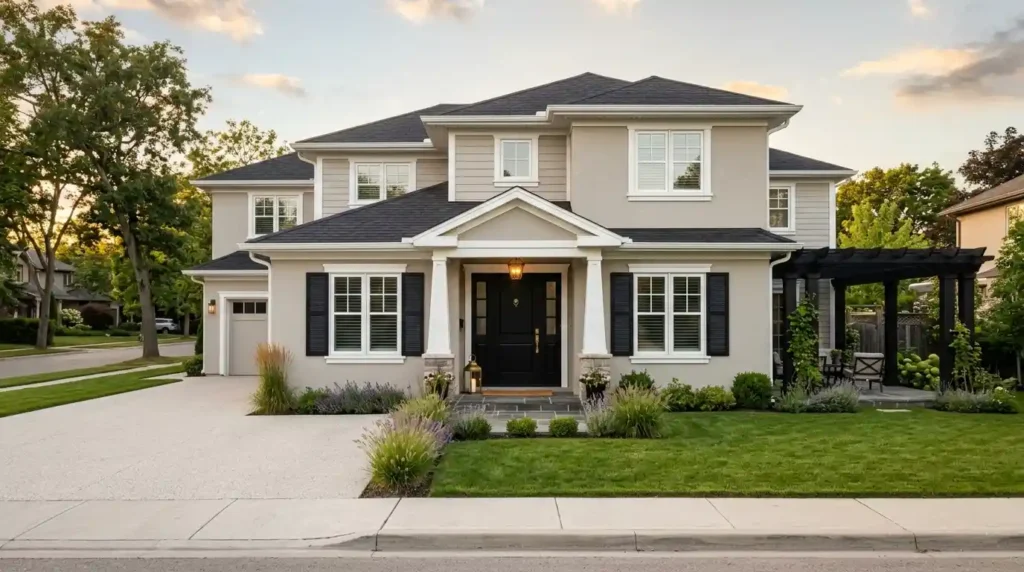
The front door is where tricorn black has built its widest reputation, and the reason is straightforward: a black front door with crisp white trim creates the clearest, most legible exterior statement available in residential architecture without requiring any other changes to the home. Against a light exterior warm off-white, greige, pale grey a tricorn black front door with brass or matte gold hardware reads as instantly considered and deliberately designed. That specific combination of high contrast color scheme with metallic accent has become a design shorthand for confident taste, and it holds up because the colour delivers exactly what the context requires.
The black exterior paint application extends naturally to garage doors, shutters, porch railings, pergolas, and fence sections. Dark colors like tricorn black make garage doors recede visually, which removes them as a dominant visual element on the facade and lets the architectural features carry more weight. Applied to shutters, it creates a frame-and-anchor effect that gives the front elevation a composed, finished quality that lighter shutter colours rarely produce. The practical note Jackie Jordan didn’t need to make but that any painter will confirm: dark colors hide dirt considerably better than light ones, which makes tricorn black a genuinely sensible choice for high-contact surfaces like doors, railings, and fence sections that would show grime on a pale finish within weeks.
Interior applications require honest assessment of the space rather than confidence in the colour. A bedroom painted entirely in tricorn black walls, baseboards, and window casings can produce a cozy, dramatic, mid-century-adjacent atmosphere when the room has adequate natural light, light-coloured flooring to bounce light back upward, and enough wall detail (moulding, built-ins, architectural features) to break the surface and prevent it from reading as a single undifferentiated dark mass. In low-light rooms, tricorn black walls go deep and moody in a way that either works magnificently or feels oppressive depending entirely on the ceiling height, the floor colour, and how much furniture and light the room is carrying. Test the swatch. Don’t skip this step.
Kitchen cabinets and kitchen islands are where tricorn black earns consistent applause with the least risk. A black kitchen island in tricorn black against white or light grey perimeter cabinets creates the high contrast design that reads as sophisticated and current without committing the entire kitchen to a dark palette. Tricorn Black kitchen cabinets work best in kitchens with strong natural light sources, light countertops quartz or marble in pale tones and hardware in brass or matte black that keeps the tonal palette coherent.
Finish Selection and Surface Preparation — the Details That Determine Whether It Works
Matte finish black paint is on the rise across interior applications specifically because it adds depth without shine, softens the intensity of a very dark colour, and reads as more sophisticated in living spaces than the semi-gloss that used to default onto walls. The trade-off is cleanability matte finishes require gentle cleaning with a microfiber cloth or damp sponge and mild soap, and harsh cleaners will flatten the surface finish visibly. For walls in living areas, matte or low-sheen finishes minimise surface imperfections and create the velvety backdrop that tricorn black does best at this finish level.
Satin finish Tricorn Black works well on trim, interior doors, and built-ins where a slight sheen provides better durability and makes surfaces easier to clean without reflecting light harshly. Semi-gloss or gloss finish applies to cabinetry and exterior applications where durability against weather and washing justifies the higher sheen and the light reflection that comes with it. The satin Tricorn Black door is the most commonly specified finish for interior doors for good reason: it reads as considered rather than commercial and holds up to daily contact better than matte.
Surface preparation determines whether the finished result looks professional or reveals every flaw. Dark colours demand meticulous prep because they amplify every imperfection rather than hiding it. Clean the surface thoroughly oil-free, grease-free, dust-free. Sand glossy areas lightly to create a key for adhesion. Apply a tinted primer before the topcoat a primer tinted toward the dark colour reduces the number of coats required to achieve full, even coverage and prevents the patchiness that dark colours expose on inadequately primed surfaces. One to two coats of tricorn black over a properly tinted primer is the standard for a smooth, even result. Skipping the primer and relying on additional topcoats is the approach that produces streaks.
Samplize peel-and-stick samples are the correct way to test tricorn black before committing to any significant application. Place samples in at least two locations in the room one in natural light, one in the area that gets most of the artificial lighting in the evening. Snap a photograph during daytime and again in the evening to evaluate how the colour reads under both conditions. Pair the swatch with your existing trim colour Sherwin Williams Extra White, Pure White, or whichever white you’re working with to confirm the contrast level is what you’re expecting before the first tin gets opened.
Conclusion
Tricorn black earns its reputation the quiet way not by being fashionable, but by being reliably, consistently itself across every application, finish, and lighting condition it encounters. That neutrality is the thing. Most black paints make a secondary commitment to warmth or coolness or a colour family that shows up eventually, usually at the worst possible moment. Tricorn black doesn’t. LRV 2.4, no detectable undertones, and a colour that pairs with brass hardware, chrome, matte gold, warm neutrals, and cool whites without requiring any particular accommodation from the palette around it.
The front door, the kitchen island, the shutters, the interior accent wall — every one of these applications works because the colour brings exactly what the space needs and nothing extra. It doesn’t compete with the architecture or the materials or the light. It frames them, anchors them, and makes everything adjacent to it read crisper and more intentional.
The practical requirements are straightforward: tinted primer, correct finish for the surface, proper surface preparation, and a Samplize sample tested in real lighting conditions before the first coat goes on. Get those right and tricorn black delivers the result that every designer shortlist, every Top 50 ranking, and every homeowner who tried it and stayed with it has been pointing toward for years.
FAQs
Light Reflectance Value measures how much light a paint color bounces back into a room on a 0 to 100 scale, and Tricorn Black sits at roughly 2.4 to 2.45, close to the practical floor for residential paint. That low number means the color absorbs nearly all the light hitting it, producing the deep, velvety black that reads differently from any dark grey or charcoal trying to pass as true black..
Caviar sits at a technically close LRV of 2.94 but carries a warm brownish undertone that gives it a softer character, while Iron Ore reads as a dark grey with subtle green undertones that can flash slightly purple under certain lighting. Tricorn Black stands apart because it holds a genuinely neutral undertone across lighting conditions, which is why it stays consistently black rather than shifting warm or cool depending on the room.
Clean the surface thoroughly so it’s oil-free, grease-free, and dust-free, then lightly sand any glossy areas to create a key for adhesion. Applying a tinted primer before the topcoat is essential with a dark color like this, since it reduces the number of coats needed for full coverage and prevents the patchiness that shows up on inadequately primed surfaces.
Matte works best on interior walls since it softens the intensity of such a dark color and creates a velvety backdrop, though it requires gentler cleaning than other finishes. Satin is the standard for trim, interior doors, and built-ins where a bit more durability and easier cleaning matter, while semi-gloss or gloss is reserved for cabinetry and exterior applications that need to hold up against weather and repeated washing.
It can work beautifully for a full bedroom, but only under the right conditions: adequate natural light, light-colored flooring to bounce light back up, and enough architectural detail like molding or built-ins to break up the surface so it doesn’t read as one flat dark mass. In a low-light room without those elements, Tricorn Black walls can feel oppressive rather than dramatic, which is exactly why testing a swatch in the actual room before committing matters so much.
Benjamin Moore Onyx comes closest among that brand’s offerings to a pure, neutral black, though the color match isn’t perfect and attempting a direct cross-brand match risks a formulation that doesn’t perform identically. Other Benjamin Moore options often mistaken for a true black, like Black Tar, Wrought Iron, and Kendall Charcoal, all read lighter or more charcoal-toned than genuine Tricorn Black.